Ever wondered how long you could actually drive after your gas light turns on? Well, Justin Davis at http://www.tankonempty.com might have an answer for you. Justin has been collecting reports from daredevil drivers about how long they’ve driven post-gas light, and he was kind enough to give me his data.

The dataset is pretty extensive, with records for every make and model imaginable—some that I’ve never even heard of! Ever seen a Vauxhall Vectra? It looks pretty unremarkable actually. They go about 32 miles after their light turns on.

So how long can you drive after the gas light comes on? The values provided by the drivers are remarkably consistent actually, with the mean value hovering between 30-40 miles. So TL;DR? You can go about 35 miles.

But if you look closely, you might notice something fishy. Starting around 1995 we have a bunch of drivers reporting the max value permitted by the website: 99 miles! Let’s look at the distribution of values…

We get two things from this: first, we see that people tend to provide ’round’ values (like 30, 40, 50) rather than values in between (see: avoiding false precision). Second, we see that there are way more 99 values than we might expect. This either means that the website isn’t built to accept a large enough range of values, or—and I think this is more likely—that most of the 99 mile values (if not all of them) are bologna. So who’s submitting these 99s? Honda, Toyota, and Ford owners account for almost half of these fishy values, but when you control for base rate, Hummer emerges as the biggest fibber. In fact, over 1/3 of the entries for Hummers are at 99 miles!

Maybe you want to see how your car stacks up. Because we have a set of estimates for each car, we can plot them according to 1) the average distance people report going, and 2) how variable those reports are. This gives us a cool plot with four distinct regions: short and unreliable, short and reliable, long and unreliable, and long and reliable.

Now lastly, the entry form also recorded the users’ IP addresses. Thanks to some simple geocoding website I found, I converted these IP addresses to latitude and longitude. So just out of curiosity, let’s see which states these data are coming from!
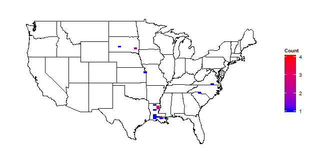
From a sample of over 11k, the densest point in the US has four respondents. That’s odd—who’s giving us all the data then? Zooming out to the whole world lets us find out.

The Turks! Yep, it seems that the vast majority of respondents are in Turkey.

It would seem that the Turks (particularly the ones in Ankara) love the tankonempty website. So do the findings generalize? You be the judge!
Want more data visualization? Check out my other posts at: https://vizthis.wordpress.com/

technology has made our life easier…
LikeLike
Really fun to read, well done!
LikeLike
I’ve often thought about that, especially since various cars will find different ways to let you know how much gas you have left – some of them even ‘lie’, so to speak. They even turn on the light early on, or way too late – it’s a fun experience; if you get to change cars often, you should try it out. It’s fun when done on purpose.
LikeLike